divbloxPHP Components
Virtually everything in divbloxPHP is a component. Components are used as the building blocks for your project. You can create any type of component for your specific requirement, from a basic image viewer to a full blown page that is made up of multiple individual components. There are templates for navigation bars, page setups, CRUD functionality and more. Each component can be modified and reused as required, dynamically across your whole project.
Component Types
divbloxPHP allows you to create any of the following types of components:
- Data model related components
- Page components
- Custom components
- Basic components
Data model components
Data model components allow for the CRUD behaviour of any of your data model entities. divbloxPHP can generate the following CRUD components from your data model:
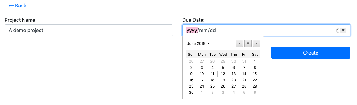
- Create component:
- Displays input boxes for the relevant attributes of your entity along with a save button.
- Processes the request to the server to create a new instance of your entity and store it in the database
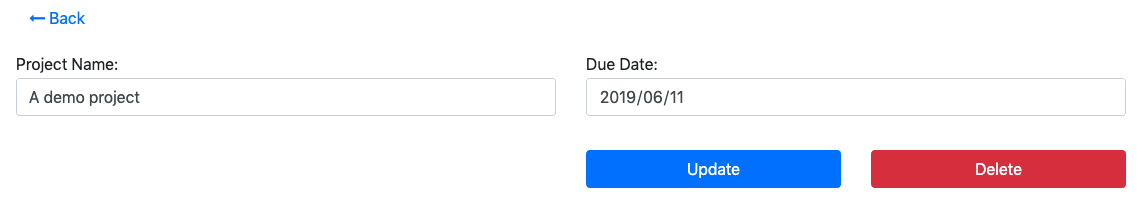
- Update component:
- Displays pre-populated input boxes for the relevant attributes of your entity along with a save & a delete button.
- Processes the request to the server to update or delete the existing instance of your entity in the database.
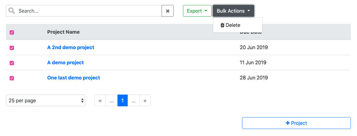
- Data Table component:
- Displays a tabular view with data from the database for the selected entity. The data can be searched and/or constrained as required.
- Allows multiple functions to be executed on the data set, including Excel,csv or text export and bulk deletion.
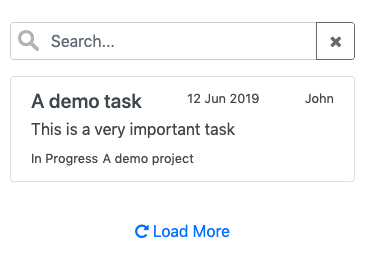
- Data List component:
- Displays a list view with data from the database for the selected entity.
- The data can be searched and/or constrained as required. This is intended to be a more mobile friendly way of viewing data for a specific entity.
Custom components
Custom components allow you to create any specific type of functionality for your app. Create anything from an image viewer or an html editor, to file uploaders and charting tools. Divblox ships standard with the following custom components:
- Data Visualization: ChartJS with examples
- Navigation: Various types of navbars, including top, bottom and side navbars
- System:
- Authentication: Allows for a user to authenticate or log in to your solution
- File upload: Provides a modern file uploader and processes the uploaded file on the server
- Image upload: Similar to the file upload component, but for images. Provides basic image manipulation such as crop and resize, etc.
- Rich text editor: A wysiwyg editor that processes your html input and sends it to the server
- Native versions of file and image upload, including native camera access
- A basic image viewer
Page Components
Page components are the parent components to any functionality in your application. You have default template options to choose from, each with a different navigation bar type, or even without one.
Basic components
Basic components are typically components that do not necessarily have a server-side requirement. These can range from simple alerts and buttons, to modals and progress bars.
info
divbloxPHP ships standard with the majority of bootstrap's UI components
Component DNA
Components are typically made up of the following parts:
- An HTML file
- A CSS file
- A Javascript file
- A Php file
- A JSON file
info
The exception here is basic components. These types of components usually reside within existing components to provide additional specialized functionality.
Component HTML
The component's HTML file describes the component's layout. The basic structure of any component's HTML follows the following pattern:
Component CSS
The component's CSS file provides any special styling that is required by the component. By default this is empty
Component Javascript
The component's Javascript file controls the component's behaviour. The basic structure of any component's Javascript follows the following pattern:
As seen above, this class ungrouped_demo_component extends the DivbloxDomBaseComponent class from which every divbloxPHP component inherits. This class manages the following behaviour for each component:
- Loading workflow, which includes checking of prerequisites and dependencies
- Error handling
- Component & Subcomponent resets
- Event handling and propagation
Component Php
The component's Php file handles server-side requests for the component. The basic structure of any component's Php follows the following pattern:
Component JSON
The component's JSON file is used for component configuration. By default this is empty.
How components work
Every divbloxPHP component follows a certain recipe. The extremely high-level view of this is diagrammed below.
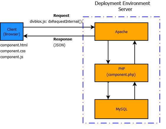
info
Each of Divblox's components communicates between client and server independently. A component is made up of 5 independent files, each responsible for their own unique functionality (as discussed in Component DNA).
To make a call from the component JavaScript (front-end) to the component php (back-end) we will make use of the global function dxRequestInternal();. This is the default function to send a request to the server from the Divblox front-end and automatically takes care of some additional heavy lifting:
- It determines the current state of the connection to the server in order to either queue, deny or process the request
- Automatically disables the DOM node that triggered the request while the request is being processed
- Manages sending and receiving the authentication token that identifies the current session
- Ensures that the result that is returned will always be a valid JSON object
- Executes a success or failure callback function based on the result received from the server
Our component.php script extends the class ProjectComponentController which takes care of the heavy-lifting with regards to processing the request on the server side:
- Processes all the input received from the request
- Receives, evaluates and renews the authentication token that identifies the current session
- Checks whether the current request is allowed to be performed
- Executes the function specified by the input variable
f("ourFunctionName") - Deals with, and formats the returned data
How Divblox loads a page
Remember, a page in Divblox is also a component and can be loaded into view just like any other component using the loadComponent(); function. However, the loading of the current page component forms part of the way that Divblox is initialized in our index.html file. Below, we will have a look at what this initialization flow looks like.
When you navigate to your project root folder, the default index.html file ([project_root]/index.html) is loaded by the webserver. This file loads the initial CSS and JavaScript for Divblox:
- CSS
- Bootstrap 4
- Font-Awesome
- project.css
- themes.css
- variety of icons and splash images
- JavaScript
- JQuery
- divblox.js
To kick off Divblox's initialization workflow, the function initDx(); from divblox.js is called. This function starts the following chain of events:
- Checks whether we are in native mode or not
- It then loads all necessary dependencies via the function
loadDependencies(); - Then the function
checkFrameworkReady();is called:- Check config parameters such as debug mode and SPA mode and act on them
- If not in native, register eventhandlers for the progressive web app to be installed
- Also register eventhandlers for online and offline states of our app
- The function
on_divblox_ready();is called:- Check if it needs to prepare page inputs - based on input parameters in the URL
- If we are not in native mode, SPA mode and all pages are prepared, then the page will be processed.
- The minimum needed for this is a
?view=[page_name]parameter in the URL
- Divblox will then load up the page in the body of
index.htmlwith the relevant page component
Component Builder
The Divblox component builder allows you to create and manage your project’s components in a visual environment and to combine various different components to create specific components for your project’s needs.
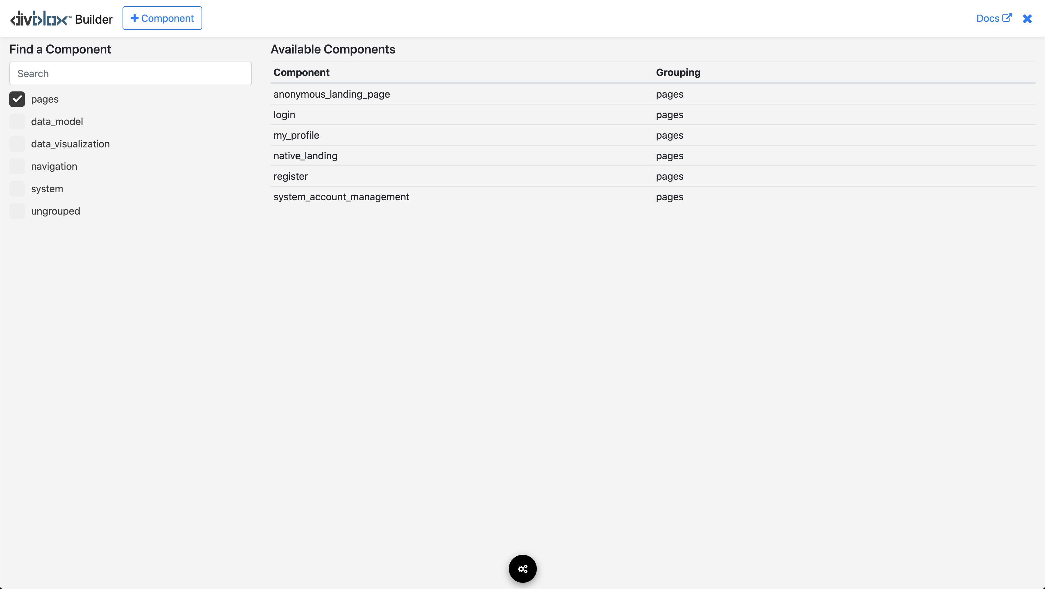
From the default component builder page you can do the following:
- Search for existing components using the search bar at the top right of the page
- Open an existing component in order to work on it
- Create a new component, either from an existing one or from scratch
Creating a new component
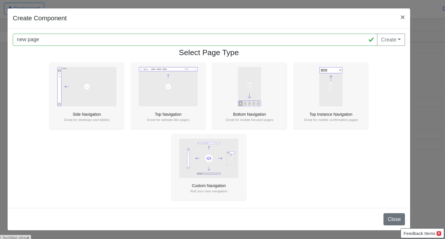
Clicking the + Component button brings up the following modal:
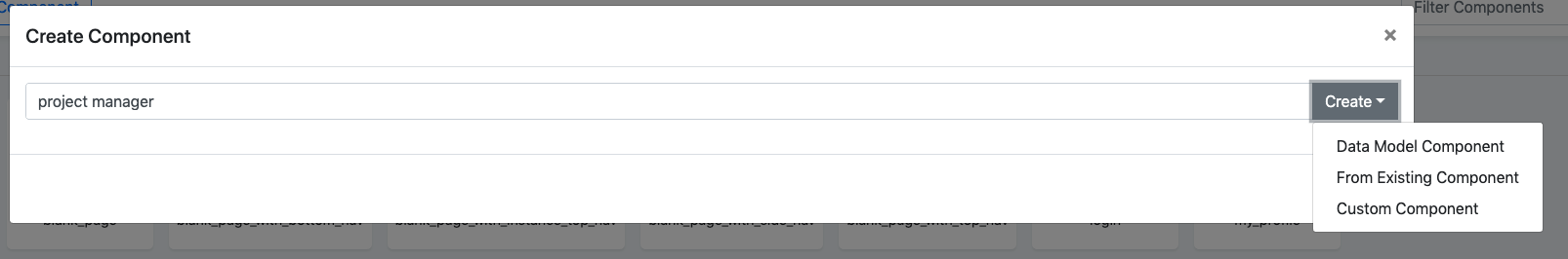
Here you can give your new component a name and select the type of component you want to create.
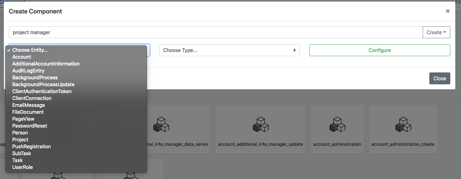
Creating a data model component
Selecting a Data Model Component will provide you with the options to select the entity for which you want to generate, as well as the type of data model component to create:
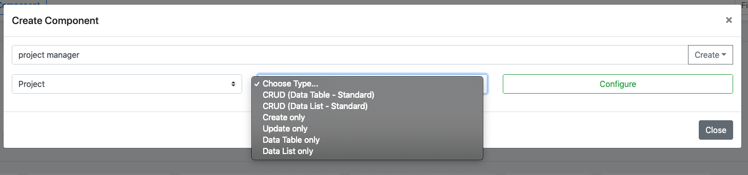
Once you selected your entity and component type, you can configure the attributes and/or validations that you would like Divblox to generate for the component.
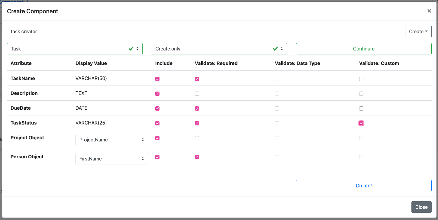
The example below shows a typical configuration modal for a "CREATE" type of component, which allows you to configure which attributes to display and to select the specific validations you require for them:
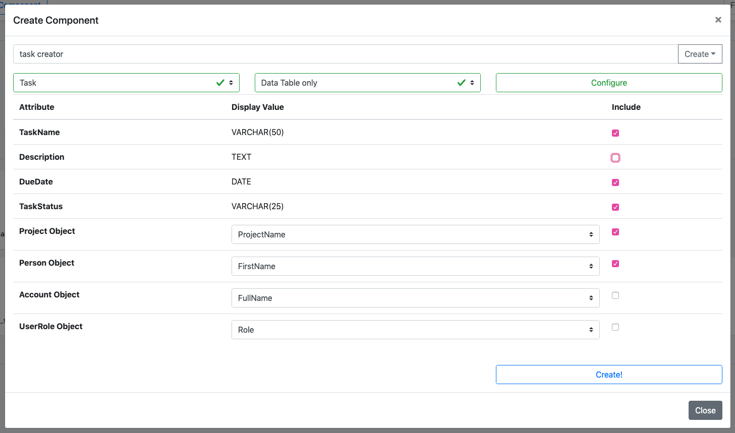
The example below shows a typical configuration modal for a "DATA TABLE" type of component, which allows you to configure which attributes to display in the table:
Creating from an existing component
You can easily copy the functionality from an existing component be selecting the "From Existing Component" option. This will allow you to specialize the functionality of that component for your needs.
info
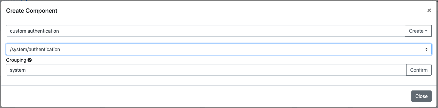
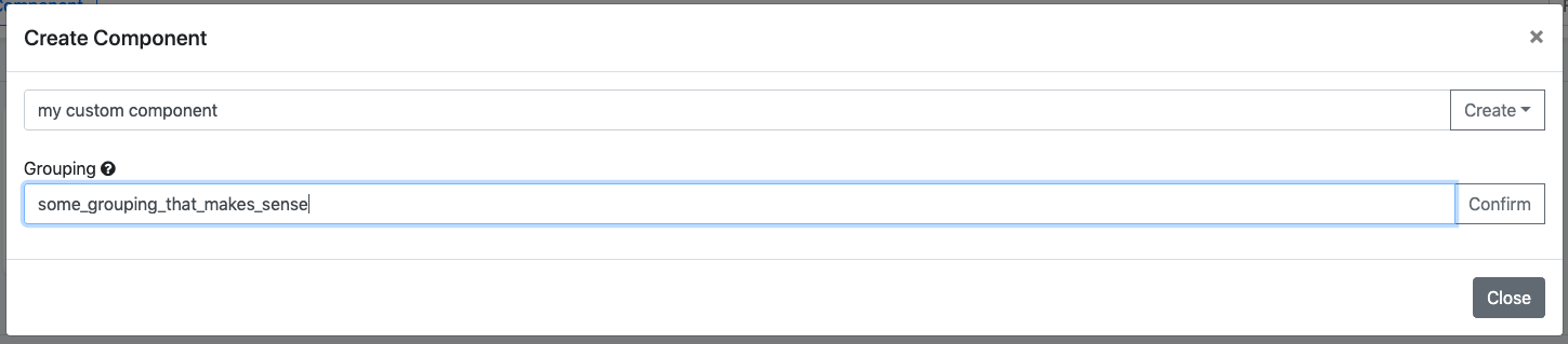
Notice the "Grouping" field above. This field allows you to group certain components together in folders for a better organized project.
Creating a custom component
You can also create a custom component by selecting the "Custom Component" option. This simply allows you to provide a name and grouping for your component.
info
Custom components ALWAYS start out as blank components
Visual Builder Interface
The component builder visual interface allows you to create any type of layout that you might require. Using Bootstrap's grid system, it allows you to place the following containing elements on the screen to begin with:
- Containers: Containers are the most basic layout element in Bootstrap and are required when using the grid system. Choose from a responsive, fixed-width container (meaning its max-width changes at each breakpoint) or fluid-width (meaning it’s 100% wide all the time).
- Rows: Multiple rows can be placed inside each container and they serve the purpose of being wrappers for columns
- Columns: A column is the final containing element within which you can place your components
- Learn more about Bootstrap's grid system here
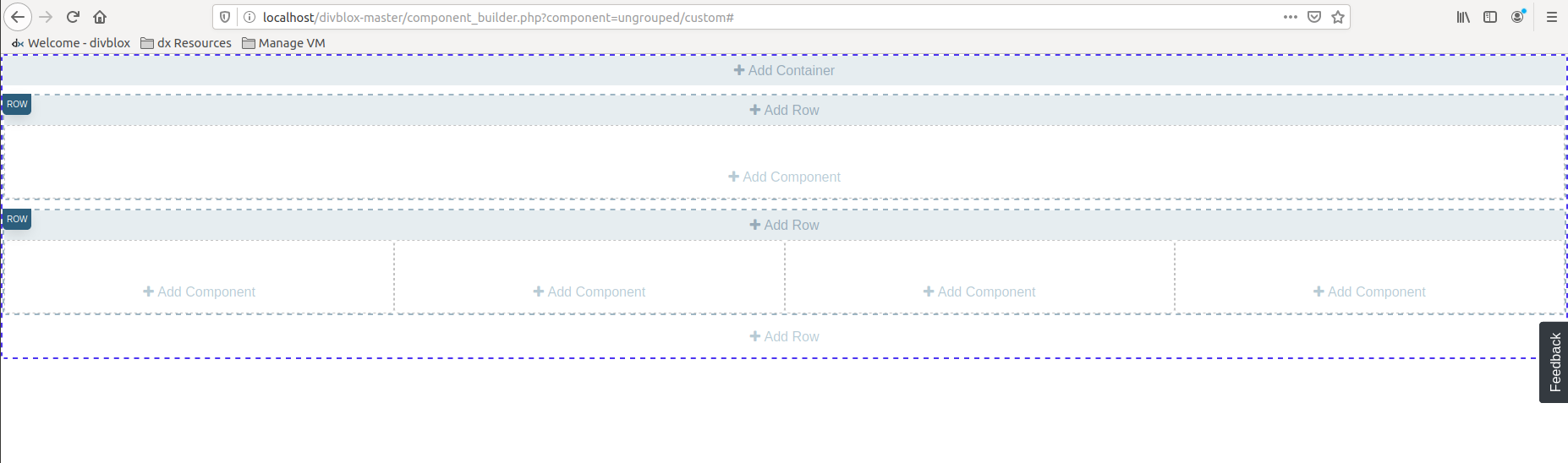
Adding a sub component
You can add a component as a sub component to the current page (which in itself is a component). You can also add basic components. See below:
Adding custom html
You can add custom html to the current component. See below:
Modify a component
The builder interface allows you to modify your component in the browser at any time. See below:
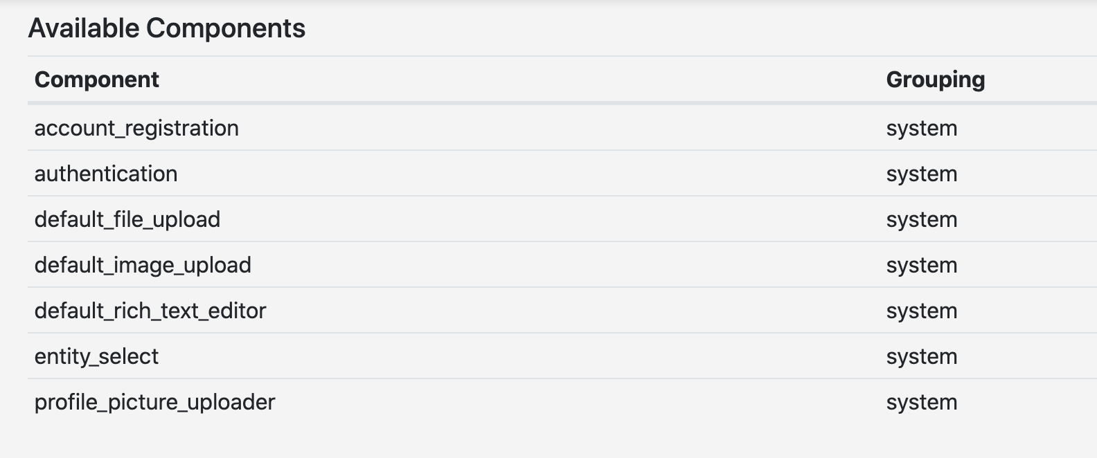
System Components
Now that we have gone through what components actually are and how they work, let us look at the system components that come standard with any Divblox application. These components come by default in the Divblox installation and can be seen when opening the component builder for the first time.
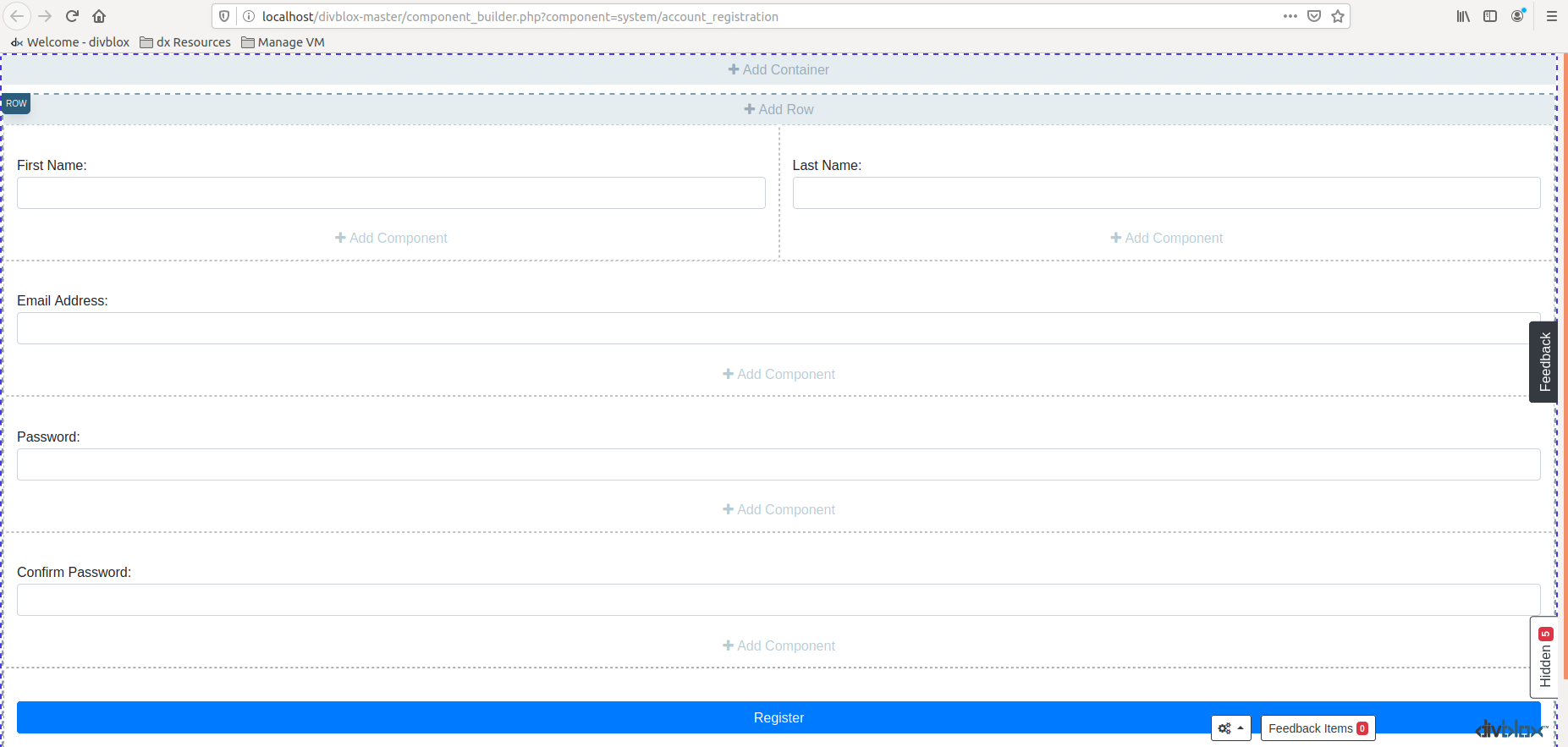
Account Registration and Authentication
The account registration and authentication components take care of user registration and authentication. These components take care of input validations and they manage the hashing and verification of passwords.
- Account Registration
- Authentication
- Performs basic validation (not empty) on input fields
- Takes care of backend validation checking uniqueness of username/email
- Manages password hashing
- Creates full name from first name and last name
- Defaults user role to 'User'
- Creates an instance of the Account entity with provided details
Default File/Image Uploader
The default file and image uploader components handle the user interface for system storing of uploaded files and images. The difference between these two is only the file type and that images have basic image editing functionality before being saved.
Both of the uploaders create an instance of the FileDocument entity, which stores all the relevant information about the uploaded file in the database.
Default Rich Text Editor
A WYSIWYG text editor. You can pre-populate the text, and save the entries as needed. The default behaviour is to log out the input to the php error log.
Entity Select
In some cases, you need to select a specific entry of an entity from the database in order to link it to something else. When the database table for this entity becomes very large, it can have a performance impact when doing this with a standard drop down. This is where the entity select component comes in handy.
It provides an input search box that allows the user to start searching for a specific entry and then displays a list of matching results from which the user can pick one. When the user clicks on a result, the corresponding ID is provided to the component.
info
The entity select component can be seen as an auto-complete for entities.
Native Camera and File/Image Uploader
These provide the functionlity their names suggest, at a native level.
Profile Picture Uploader
This is a specific instance of the default image uploader which saves the image directly into your profile.